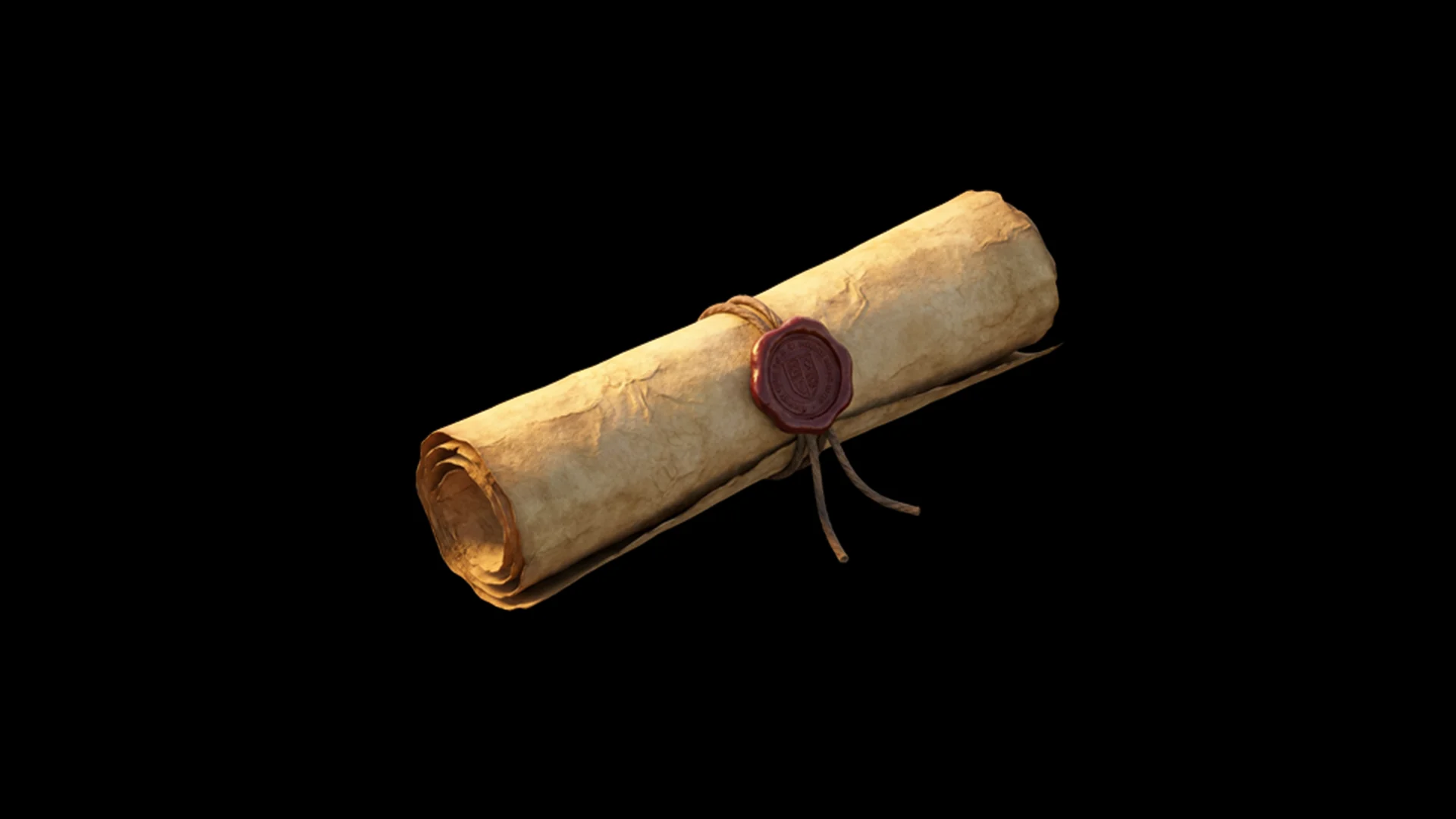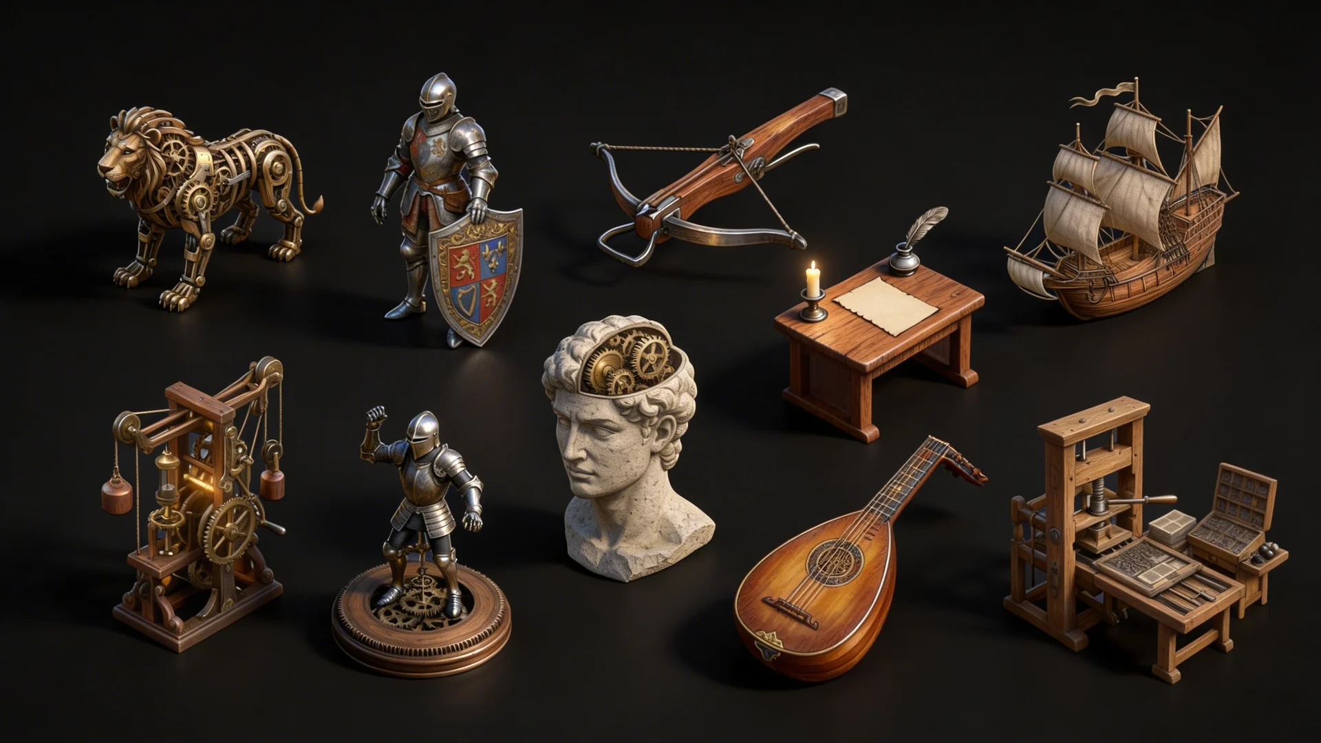
15th Century Interface Icons
Project Overview
During the initial stages of building Lightforgedmedia.com the direction of the website was quite different.
Our branding revolved around a 15th century look and feel, which reflected a commitment to time honored values and matched the blacksmith and his forge.
After user testing it was found while the brand communicated the concepts we hoped, there was a need to simplify the design which still reflected values and creative concepts which embody Light Forged Media.
Services Provided
Deliverables